Chalkboard Economics: What a Saturday Market Teaches a Landing Page
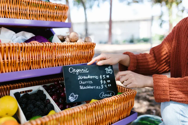
On a wet Saturday in Leeds, the best sign at the market is rarely the biggest. It is the one you can read from the queue: 'Proper Yorkshire rhubarb — £2 a bunch — gone by noon.' Product, price, proof, nudge. No carousel. No stock photo of a handshake. Just a line doing the work of a whole page.
That is not a quaint detail. It is a masterclass in conversion copy, delivered in biro on a bit of cardboard. And it is a useful corrective for UK landing pages that have inherited every design pattern going and forgotten what the first line is for.
The sign is the pitch
Market traders do not have the luxury of a scroll. They have a passer-by, a slight turn of the head and a chalkboard. So they make choices. The good ones lead with the thing you came for, then add the bit that makes you stop: 'Cornish pasties — still warm — £3.50.' The bad ones list everything they sell in six colours and expect you to do the sorting.
Landing pages often behave like the bad stall. The hero says 'Welcome to a better way' and the subhead says 'We empower businesses to unlock potential'. Meanwhile the customer is thinking: what is it, how much, and why should I care before my tea goes cold?
A trader's sign works because it answers those questions in the order a real person asks them. Offer first. Personality second. Urgency only if it is true. That order is worth stealing.
Three jobs, one line
The stall-side formula is not complicated. Say what it is. Say who it is for. Give a reason to act now. The trick is that a good trader merges all three into something that sounds like speech, not a strategy deck.
For a landing page, that might mean a hero line like: 'Fresh coffee beans for people who grind at home — roasted in Bristol, posted Tuesday.' It is specific, human and quietly persuasive. It does not say 'artisanal' three times. It does not rely on a badge that says 'Award-winning' without saying what won.
OneLine Studio's whole angle is one line at a time, and this is why. A single sentence that carries the offer is worth more than a paragraph that carries the vibe. If the first line is vague, the rest of the page is just decoration.
Put the price where the eye lands
A trader does not hide the price behind a chalkboard that says 'contact us for a quote'. They know the price is part of the pitch. UK shoppers are not fragile. They can handle a number. What they cannot handle is a product card that makes them open a chat window to find out whether they can afford a candle.
This does not mean every page needs a hard price. It means the commercial reality should be visible early. 'From £12' is a line. 'Plans start at £8 a month' is a line. 'Bespoke pricing tailored to your needs' is a fog. If you cannot put a number on the first screen, put a clear range or a clear next step. Do not make the customer do archaeology.
The patter belongs after the sign
Traders have patter. It is part of the charm. But the patter works because the sign has already done the functional job. The joke lands after you know what is being sold.
Landing pages get this backwards all the time. The hero is a pun, the subhead is a manifesto, and the actual product is somewhere near the third scroll. Playfulness is good. OneLine Studio is not against a bit of nerve. But wit should sit on top of clarity, not replace it.
A useful test: cover the headline and read only the subhead. Can you still tell what the business does? If not, the joke is carrying too much weight. Put the offer back on the chalkboard and let the personality be the wink, not the whole face.
Checkout is the till, not the theatre
At a market stall, the till moment is short. 'Card? Cash? Bag?' That is it. The trader does not deliver a monologue about the heritage of the paper bag. They keep the queue moving and add one useful bit of reassurance.
Checkout microcopy should behave the same way. One line per step, doing a real job: 'No card details stored', 'Free returns within 30 days', 'We will email tracking tonight'. Not a poem. Not a brand essay. Not a guilt trip about abandoned baskets. Just the next useful thing, said plainly.
If your checkout needs a paragraph to explain why the customer should trust you, the problem is probably earlier on the page. The till is for confirmation, not conversion theatre.
A five-minute stall audit
Try this on your own landing page. It is not a full content strategy. It is a sharpening exercise.
- Read the hero aloud. If you stumble, rewrite it shorter.
- Ask a colleague to repeat the offer after one glance. If they cannot, the first line is doing too many jobs.
- Delete every adjective in the headline and see what is left. If nothing is left, you had decoration, not a claim.
- Check whether the price, range or next step is visible on the first screen.
- Count the jokes. Keep one. Move the rest below the fold.
- Test the page on a phone at arm's length. If the offer disappears, it is too small or too clever.
- Read the checkout buttons and reassurance lines. Do they sound like a till or a TED talk?
The line before the line
The market stall is a good teacher because it cannot cheat. There is no autoplay video, no sticky navigation, no 'book a discovery call' button pretending to be a product. There is a person, a sign and a customer deciding whether to stop.
Your landing page has more room, which is exactly the problem. Use the chalkboard test: if you cannot write the offer on a small board and make a stranger look twice, you have not found the line yet. Find it first. Then design around it.
That is the OneLine Studio way, really. Sharp design, one line at a time. The stall traders have been doing it for centuries.