The Glance Test: What UK Roadsides Teach Your Homepage About Saying Less
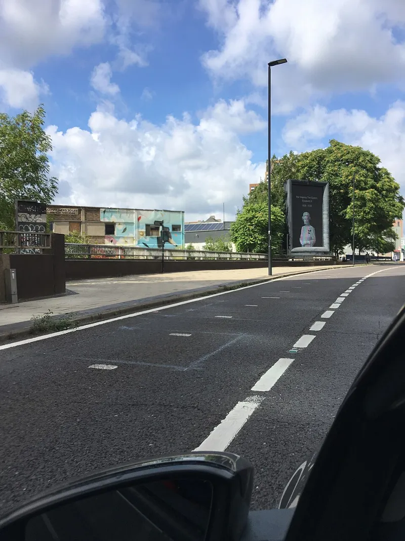
Photo: mia!, CC BY-SA 2.0, via Wikimedia Commons
There is a stretch of the A40 where the traffic slows just enough to study the posters. A 48-sheet, a bus side, a pharmacy window with a public health notice taped slightly wonky. None of them get a second chance. You see them, you get them, or you don't. That is the deal.
Websites are not billboards. They scroll, they personalise, they remember your basket. But the first viewport might as well be a 48-sheet. The user arrives with a glance to spare. If your homepage needs a paragraph and a diagram before it says anything useful, the roadside has a lesson for you.
Why the roadside is a brutal design tutor
Outdoor advertising in the UK is constrained in ways digital designers often forget. A poster has to survive bad weather, awkward angles, a moving bus and a distracted driver. The viewing distance is fixed. The competition is everything else in the built environment. There is no hover state, no tooltip, no cookie banner politely explaining the value proposition.
That constraint forces a decision: what is the one thing? Not the five things. Not the brand story, the product range and the seasonal promotion in a tidy grid. The one thing that earns the glance.
Digital design often pretends that attention is infinite. We design for the scroll before we have designed for the squint. The billboard asks a harder question: if this had to work at 70mph, what would you keep?
The one-line discipline
The best UK outdoor work tends to share a quality that is easy to name and hard to do: one line, one idea. It is not about being terse for the sake of it. It is about hierarchy. The line is the whole composition, and the negative space around it is doing a job rather than waiting for content.
Specsavers is the obvious example. The line is so embedded in the brand that the poster barely needs to explain itself. Greggs has done something similar with launches that rely on plain, confident wording and a strong visual rather than a paragraph of justification. Public health campaigns such as Catch it, bin it, kill it show how a single instruction can become a behaviour. These are not just slogans. They are complete ads.
Your homepage is allowed to be more generous than a poster. It is not allowed to be less clear. The first screen should still answer three questions in a glance: what is this, who is it for, and what do I do next? If the answer to any of those is buried below the fold, you have designed a leaflet and called it a poster.
Three things to steal from the roadside
First, design the hero as a poster. One promise, one supporting line, one call to action. Not a carousel of competing promises. A carousel is just five posters arguing with each other.
Second, let the line carry the personality. The visual can be beautiful, but the line should do the work. If the headline is generic, no amount of art direction will rescue it. Write the line first, then design around it.
Third, respect the glance. Test the first viewport on a phone at arm's length, then on a laptop while someone is talking to you. If you cannot recall the main message five seconds later, it is not a glance test failure. It is a brief failure.
From 48-sheet to homepage: a practical checklist
- One promise per viewport. If everything is loud, nothing is heard.
- Headline under eight words where possible. The subhead can be twenty, but only if it earns the space.
- One primary call to action. One verb, one colour, one obvious place to click.
- Delete the welcome line. No one has ever been persuaded by Welcome to our website.
- Squint at it. Blur the screen or step back. The hierarchy should still be legible.
- Check the mobile thumb zone. The best line in the world is useless if the button is in the wrong postcode.
- Use contrast properly. Outdoor has to work in daylight and drizzle. Digital has to work for everyone, including people with low vision.
- Test recall with five people. Ask what the site does and what they would do next. Their answers are your poster review.
When digital gets to cheat
Digital does have advantages. Motion can extend a line. Personalisation can change the line for a returning customer. Scroll can unfold the detail after the first impression. But those advantages should extend clarity, not postpone it. The first viewport is the poster. The rest is the leaflet. Personalisation should swap the line, not add five more.
This is where one-line thinking becomes a brand strategy rather than a stylistic preference. A one-line brand knows what it is for. It can be warm, funny, technical or quietly premium, but it has made a decision about hierarchy. If you cannot say what the one thing is, the billboard will expose it. So will the homepage.
Next time you are stuck in traffic, look at the poster. It had one job. Your homepage does too. Give the glance something worth keeping.