A Knowing Look: Playful Design That Doesn't Patronise UK Customers
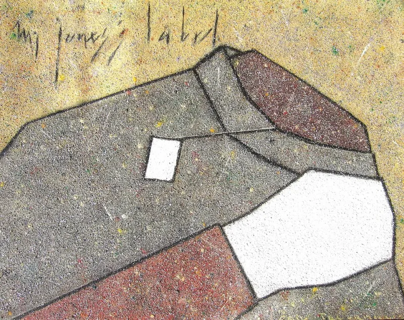
Photo: Onlysilence, CC BY-SA 3.0, via Wikimedia Commons
Playfulness is easy to spot and hard to get right. The wrong version looks like a children's menu: primary colours, a cartoon mascot with a speech bubble, exclamation marks doing the work of a personality. The right version is quieter. It is a knowing look across a serious room. It says we take the work seriously, not ourselves.
For UK brands, that distinction matters. British audiences are unusually good at detecting forced fun. We have a long tradition of dry humour, understatement and self-deprecation. A brand that tries too hard gets the same look you give a corporate away-day icebreaker. The wink has to come from somewhere real.
Why forced quirk backfires
Forced quirk usually starts with a desire to seem human. That is not a bad instinct. But human does not mean wacky. A law firm with a cartoon gavel is not being playful. It is being nervous. A B2B software company that fills its error messages with emoji is not charming. It is making a bad day worse.
Quirk becomes a smell when it is decorative rather than rooted. If the joke could be lifted out and pasted onto a competitor without anyone noticing, it is not brand personality. It is a costume. And UK customers can spot a costume at fifty paces.
The anatomy of a grown-up wink
There are four levers worth pulling: typography, colour, motion and copy. Use them sparingly. A wink is more effective than a whoopee cushion.
Typography
Pick one characterful face and one workhorse. Let the character face live in headlines and short statements. Keep body copy calm and readable. A single odd detail, such as a swashed ampersand or an unusually tight headline tracking, can do more than a whole page of novelty fonts. If every heading is shouting in a different typeface, the brand is not playful. It is having a panic attack.
Colour
Start with a serious base and add one unexpected accent. Farrow & Ball is a useful reference here: the names are playful, the palette is restrained. The humour lives in the language and the confidence, not in a rainbow. Primary red, yellow and blue should be reserved for actual toy shops. Everything else can use a warmer neutral, a sharp accent and a lot of white space.
Motion
Micro-motion is where a grown-up brand can have a little fun. A line that draws itself in one stroke. A button that nudges rather than bounces. A page transition that feels like a curtain being pulled back. Keep durations short, respect reduced-motion settings, and never make the animation the only way to understand the message. Motion should punctuate, not explain.
Copy
Copy is the safest place for whimsy, especially microcopy. A friendly 404 page, a confirmation email that sounds like a human wrote it, a cookie notice that does not read like a threat. UK humour works best when it is dry and understated. One wink per paragraph is plenty. If you have to explain the joke in the brand guidelines, cut it.
UK brands that get the wink right
Innocent Drinks has spent years proving that playful copy and serious ingredients can coexist. The tone is light, but the product claims are clear. Monzo uses bright colour and plain English to make banking feel less like filing a tax return, without turning current accounts into a comedy sketch. Yorkshire Tea is warm and self-aware, but it still sells tea. Giffgaff has a lowercase, community-minded tone that feels human rather than manufactured. Greggs manages to be self-aware without over-designing the joke.
Oatly is a different case. Its chaotic typography works because it is a challenger brand with a manifesto and a willingness to be annoying on purpose. Copy the surface without the substance and you get noise. The lesson is not to imitate the chaos. It is to understand where the confidence comes from.
The warning: forced quirk is a smell
Watch for the signs. A mascot with no job. Puns in legal copy. Exclamation marks in B2B. Gradient blobs described as joyful. An error message that makes you feel stupid. Whimsy that undermines trust in regulated sectors such as finance, health or legal services. In those contexts, friendly clarity is usually enough. You do not need a comedy routine. You need to sound like a competent person who is not afraid to be warm.
A practical test: the eyebrow raise, not the belly laugh
The right kind of playful design makes you smile slightly and trust the brand more. It does not make you cringe, and it does not make you wonder whether the company is okay. Ask whether a customer would repeat the line to a friend. Ask whether it still works on a bad day. Ask whether it survives being read by someone who is tired, busy and not in the mood.
A simple checklist helps:
- One playful element per screen. Let it breathe.
- Write the copy first. Decoration comes second.
- Keep the character font for headings only.
- Use the accent colour on less than ten per cent of the view.
- Make motion optional and reduced-motion safe.
- Put humour in microcopy, not in compliance text.
- Test with real customers, not just the design team.
Where one-line thinking helps
A single drawn line can be playful without being childish. It is abstract, human and slightly wobbly. It can be the wink. The rest of the layout stays sharp and grown-up. That is the OneLine Studio approach in a sentence: sharp design, one line at a time. Playfulness lives in the detail, while the structure does the serious work.
Grown-up whimsy is not a kids' menu. It is confidence with a twinkle. Keep the core clear, add one knowing detail, and let the customer meet you halfway. That is the wink.