The Timetable at the Edge of the Internet: A Holding Page That Keeps Its Word
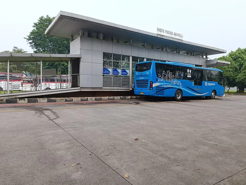
Photo: Fikri RA, CC BY-SA 4.0, via Wikimedia Commons
A coming-soon page has a bad reputation. It is usually thrown up in a hurry, dressed in a logo, and left to sit there like a wet bench. But for plenty of UK brands, it is the first proper encounter a customer has with the name. Not the homepage. Not the launch campaign. The holding page. That makes it less of a placeholder and more of a bus stop at the edge of the internet.
A good bus stop does three things without making a fuss. It tells you where you are. It tells you when the next thing is likely to arrive. And it gives you something sensible to do while you wait. A coming-soon page can borrow all three moves. It does not need to be a masterpiece. It just needs to keep its word.
Say where you are, not what you dream of being
Too many holding pages open with a grand statement and no sign of a destination. “Something big is coming.” Right. Where? When? Is it a shop, a service, a newsletter with a nice font? A bus stop with no route number is just a shelter.
The first line should do the quiet work. It can be short, specific and human. Something like: “We are building a sharper way to book a bike service. The doors open late November.” Or: “A new coffee subscription for people who read the bag. Launching this winter.” That is not a slogan. It is a signpost.
OneLine Studio’s own habit is to ask for the sentence before the mood board. The same applies here. Before you choose the typeface or the looping background video, write the one line that explains the wait. If you cannot say it plainly, the page is not ready either.
Honest timetables beat hopeful ones
“Coming soon” is the holding-page equivalent of “bus due”. It is technically true and practically useless. People can forgive a wait. They are less forgiving of a vague promise that keeps moving.
Use a real window, even a broad one. “Launching in March” is more useful than “launching soon”. “Early next year” is better than “very soon”. If the timeline shifts, update the page. A stale date is worse than no date because it quietly tells visitors nobody is minding the shop.
There is a playful way to do this without turning it into a countdown gimmick. A simple line works: “We are aiming for spring. If that changes, this page will say so.” That is calm, honest and slightly charming. It treats the visitor like an adult. In the UK, that goes a long way.
If you use a countdown, make sure it counts to something real. A timer that hits zero and reveals another holding page is the digital equivalent of the bus not turning up and the driver avoiding eye contact.
Email capture without the hard sell
Most coming-soon pages ask for an email address. That is fine. The problem is the pressure that comes with it. “Be the first to know.” “Join the movement.” “Do not miss out.” It is a holding page, not a closing-down sale.
Keep the field simple and say what happens next. One line can carry it: “Leave your email and we will send one note when it is ready. No weekly nudge, no fireworks.” That is clear, lightly funny and sets an expectation you can actually meet.
A few practical choices help. Label the field clearly. Make the button say something useful, like “Tell me when it opens” rather than “Submit”. Show a confirmation message that repeats the promise. If you are collecting addresses for a launch list, say so. If you will send a single email, say that too. People are more likely to sign up when they know what they are signing up for.
And please, do not make the email field the only thing on the page. A bus stop with a ticket machine and no timetable is not helpful. Give people something to look at, read or do.
Small design moves that keep anticipation on the right side
A holding page should load quickly, work on a phone, and look like the brand without trying to perform a full launch. A few sharp choices are enough.
Start with a clear headline and a short supporting line. Add one visual element that carries the mood: a photograph, a single illustration, a colour field, a small moving detail. Keep the motion gentle. A page that spins, blurs and bounces is not building anticipation. It is testing patience.
Useful links can fill the wait without turning the page into a menu. A link to the story behind the brand, a short FAQ, a contact address, or a preview of what is coming all give the visitor a next step. Even a small “what we are working on” list can be more engaging than a lonely logo.
Accessibility matters here as much as anywhere else. Check contrast, keyboard focus, form labels and reduced-motion settings. A holding page is still a page. It is not a poster.
The line people remember
A coming-soon page is a short conversation with someone who has just arrived. It should not pretend the wait is exciting. It should make the wait feel manageable. Say what is coming. Say when, as honestly as you can. Give people a useful thing to do. Then let them get on with their day.
That is the bus-stop standard. Not flashy. Not empty. Just clear enough to trust. One line at a time.